
Ocotillo Resort & Spa
timeline
2 Weeks
role
User Research, Design and Prototyping
tools
Figma
Brief
As part of one my projects for my Design for User Expereince course at USC, I was challenged to design my very own Hotel App. Part of the project criteria was to include certian features likes horizontal scrolling and overlays. Up to this point we have learned the foundations of the Figma design tool and how conduct user research. My goal for this project was to combine these skills to not only create an oasis that users want to stay at but also create a product that would facilitate the process of booking it. This resulted in the creation of the Ocotillo Resort & Spa.
Defining the Problem
After conducting several interviews as part of the user research process, I found that current hotels and resorts offer rooms that are mostly identical and provide no unique experience. This in conjunction with the lack of privacy deters users from staying at these hotels.
People want to book rooms that provide a unique experience and maintain a good level of privacy outside of the room.
User Research
In order to better to understand users experience at other hotels, I conducted a couple of online interviews via zoom. I decided to focus primarily on users that have been to a hotel or resort before and users that have hestitated in booking a trip. I asked questions such as:
- What was your experience like while staying at the previous hotel?
- If you could change anything about that experience, what would you change?
- What has kept you from booking a room at a Hotel in the past?
- What kind of information do you want to know before deciding to book a hotel?
- What is your process for selecting a hotel and room?
User Responses
So what did these users have to say about their previous experience at other hotels?
- "I have stayed the Hilton a couple of times before. Eventhough I booked different rooms, they all felt the same. It felt like there was difference between the high rated rooms and low rated rooms."
- "I like to book rooms at resorts because I want to get away from my busy life and have some nice private alone time with my girlfriend by the pool. But the privacy the hotels that I have booked in the past, starts and ends at the room. Sometimes I do not want to share the pool with the hundreds people that are also staying there. It would be nice to know how many other people will be poolside alongside you."
- "I have booked rooms in the past that look nothing like was shown in the pictures. I understand that they take the best pictures to sell the rooms but it is a big let down to arrive at your room only to find out that you could have booked a similiar looking room at a Motel 6."
Initial Wireframing Process

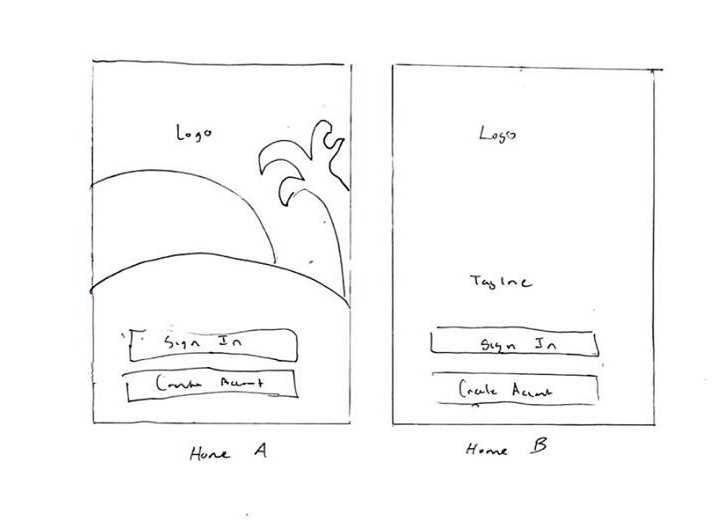
In order to ensure that users got a good first impression of the Ocotillo, I tried two different variations of the home page. Most of the elements on the home page are the same across the two designs. The biggest difference is that Home A feature a background with combination of different polygons whereas Home B would feature a poolside image and slight variation in the logo. I took the liberty to design both home pages in order to get feedback from my users. Normally I would obtain feedback by showing the wireframes themselves, but in this case I felt it neccessary to design the frames since the colors and background image make a huge difference when deciding between the two.

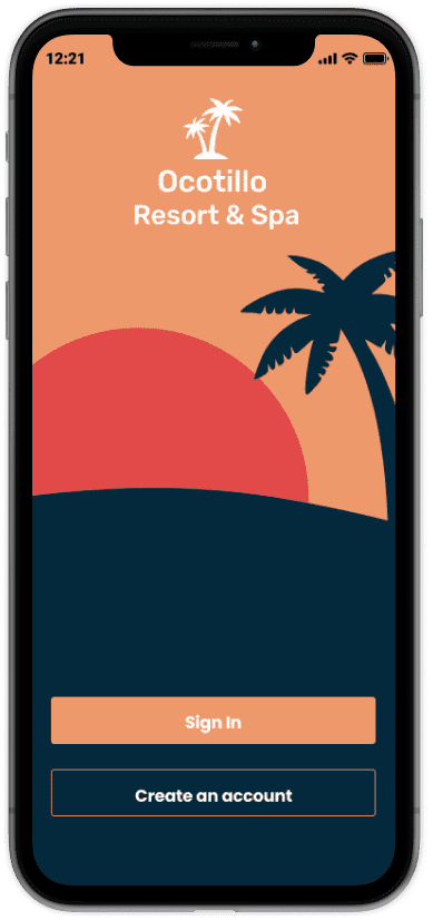

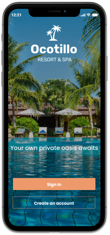
Users preferred Home B since it gave more a visual understanding of the Ocotillo has to offer, whereas Home A did not. Instead discarding Home A altogether, I decided to resuse some of the components in other pages of the app.
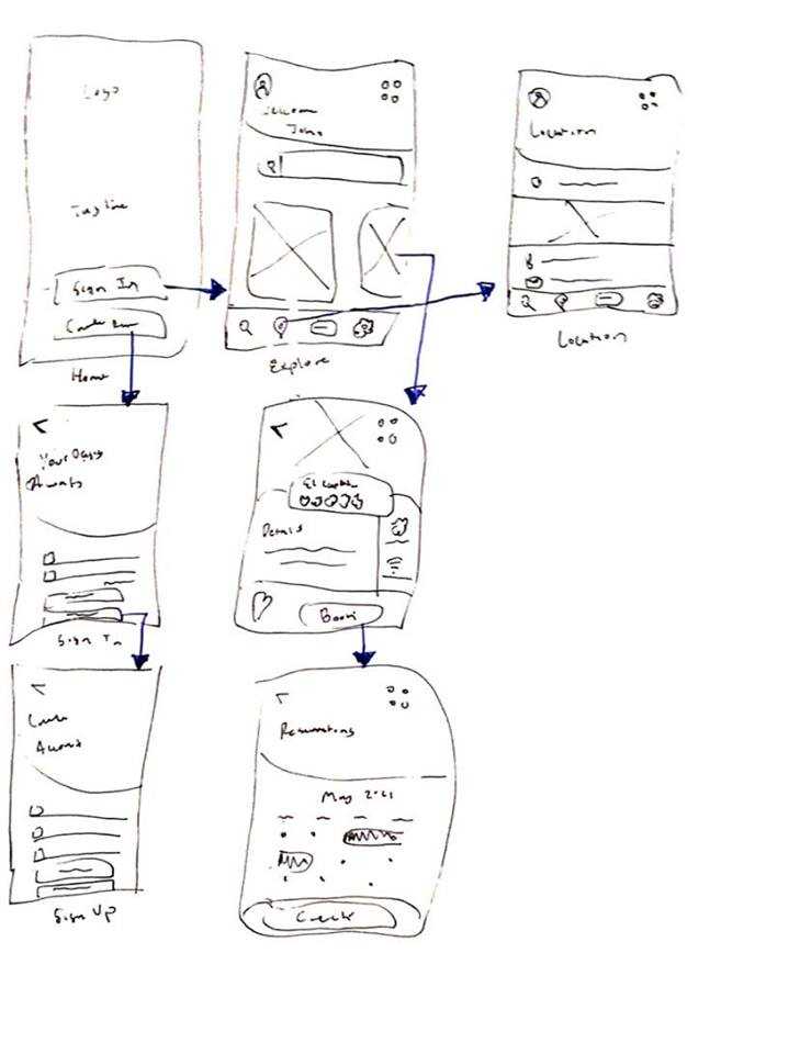
Wireframe Flow
After selecting the home page, I finalized the wireframes for the other pages keeping in mind the main criteria for the project.

Moodboard
While working on the high fidelity designs, I drew heavy inspiration from my moodboard. From here I drew inspiration for the logo design and choice of primary and secondary colors.


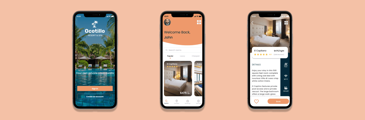
High Fidelity Designs
While working on the high fidelity designs, I drew heavy inspiration from my moodboard. From here I drew inspiration for the logo design and choice of primary and secondary colors.


Interactive Prototype
Interactive prototype created in Figma.
Reflection
This was definetly one of the most challenging and fun project I have had in the course since I was required to create something scratch. I found myself struggling in the begining since I wanted to create something that would blow the all the other Hotel apps out of the park. However, time was limited and the list of features I wanted to implement kept growing. I constantly had to remind myself on the main criteria for the project. My main takeaway from this project is that I need to do better job during the user research stage.